Website design for small businesses is key to the organisation’s growth. That’s because business websites not only function as gateways to services and products, but also speak to the credibility of the brand.
What to keep in mind when building a website? Here are a few quick stats:
- 94% of first-impressions relate to web design (Source: Webfx.com)
- 75% of website credibility boils down to design (Source: Webfx.com)
- Users form an opinion of your site in 0.05 seconds (Source: John Kramer)
- 94% of negative website feedback is related to its design (Source: John Kramer)
As such, the tips for building a small business website, suggested in this guide, will tell you how to make an effective business website and not necessarily how to build a great website yourself.
The small business space in India is a competitive one, with thousands of players vying for success and scrambling for stardom. And knowing how to build a high-quality website can help you propel your website to the top of the charts – or rather SERP! To make things easy to grasp, each point has business website examples accompanying it. Indian small business website examples have been handpicked for greater relevancy.
Here, then, are more than 10 small business website design tips you can make use of in 2021.
Pay attention to the colour scheme
Choosing the right colour scheme is among the keys to a great website. This is because colours form impressions in the mind of the viewer and over 60% of acceptance or rejection of a website is tied to this impression.
When picking a colour scheme for your website consider these factors:
- The colours already part of your branding
- Your brand’s tonality and corporate image
- The emotion sparked by the colour
- The complimentary colours you can use
Here is CoSchedule’s chart of colour psychology in marketing.
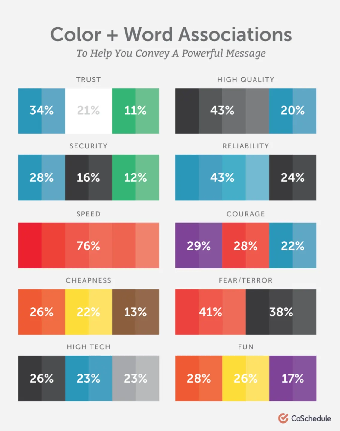 Source: https://coschedule.com/blog/color-psychology-marketing/
Now, with that in mind, take a look at how Nineleaps, an Indian start-up that provides software solutions, uses a mix of white, blue, and red on their homepage.
It works because BLUE conveys trust, dependability, responsibility, and strength. While RED speaks of excitement, vibrancy, and youth. Finally, the WHITE adds to the balance of the visual narrative and lends a sense of calm.
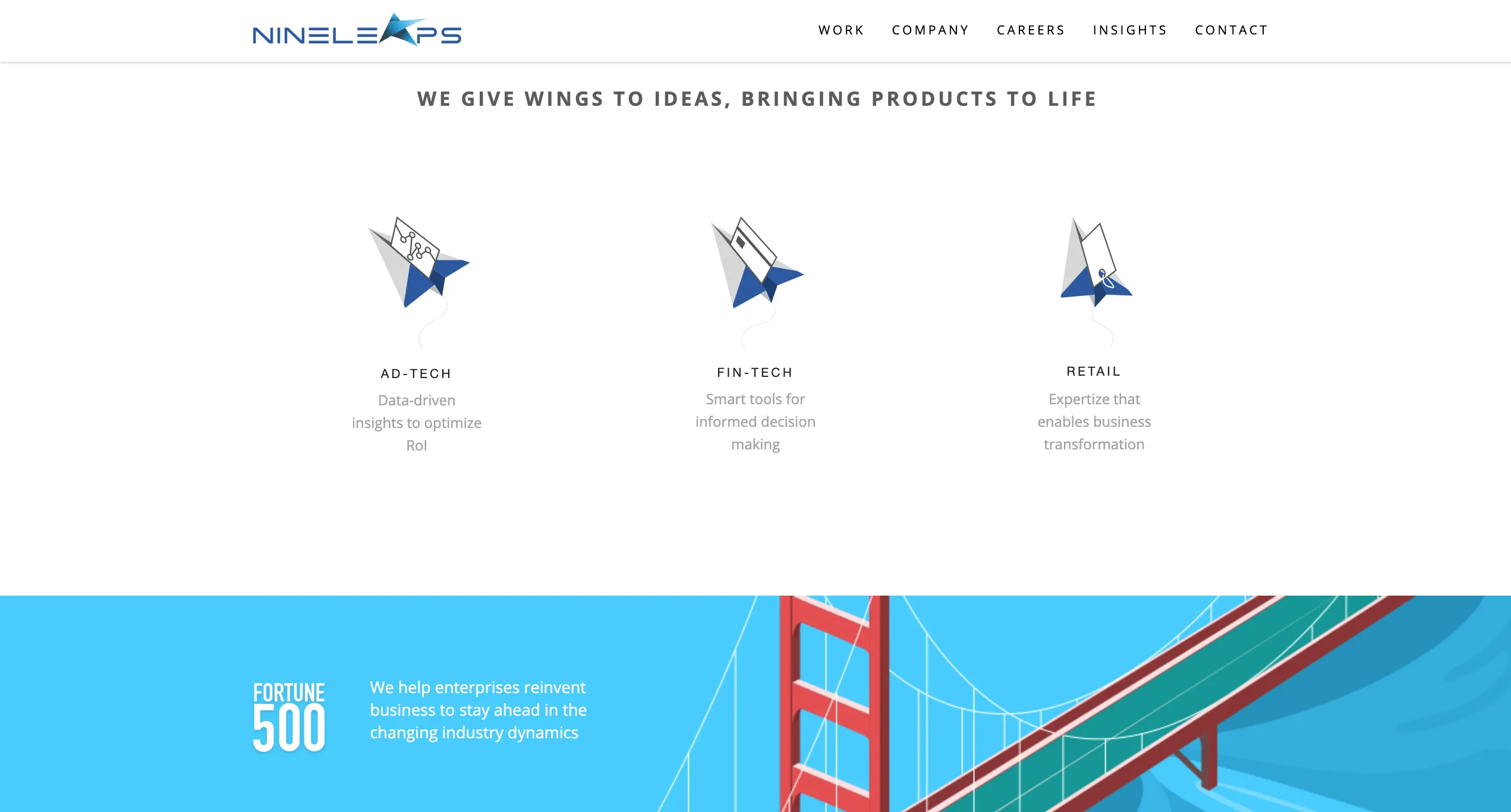 Source: https://www.nineleaps.com/
Coolberg, another start-up, and brewers of zero alcohol beer, uses tones that convey emotion, but also make its product standout.
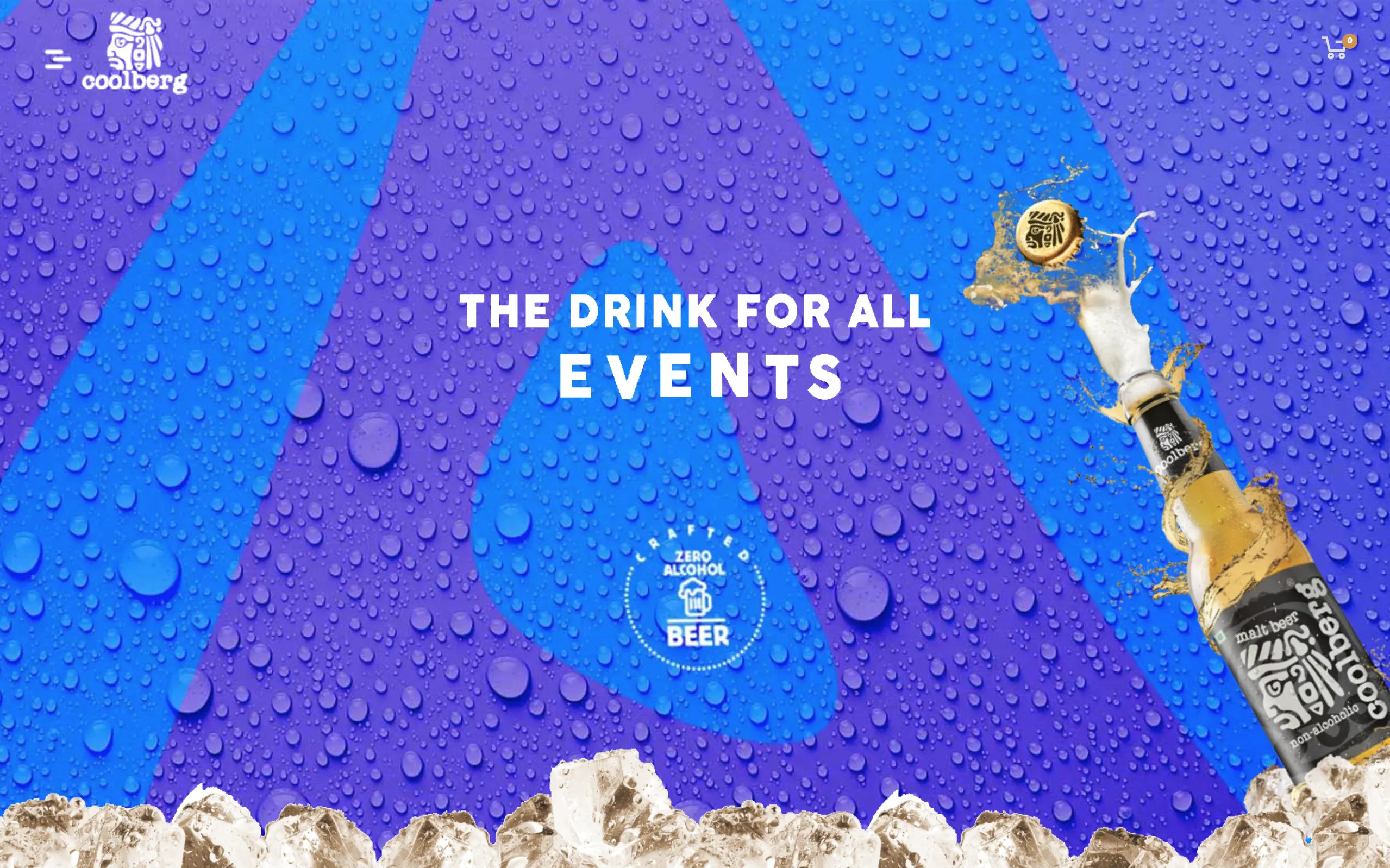 Source: https://coolberg.in/
The PURPLE speaks of quality, luxury, creativity, and imagination, while the BLUE offsets with calm and relaxation. Both these form a great backdrop for the sparkle of the golden drink.
Coolberg also carefully integrates black into its branding to showcase authority and score well on the emotional marketing front.
Pick your fonts as per your style
Like colours, fonts have a character to themselves and affect both the credibility of your website and your brand image online. Think of fonts as having a personality.
Check out Crazy Egg’s neat summary of font psychology:
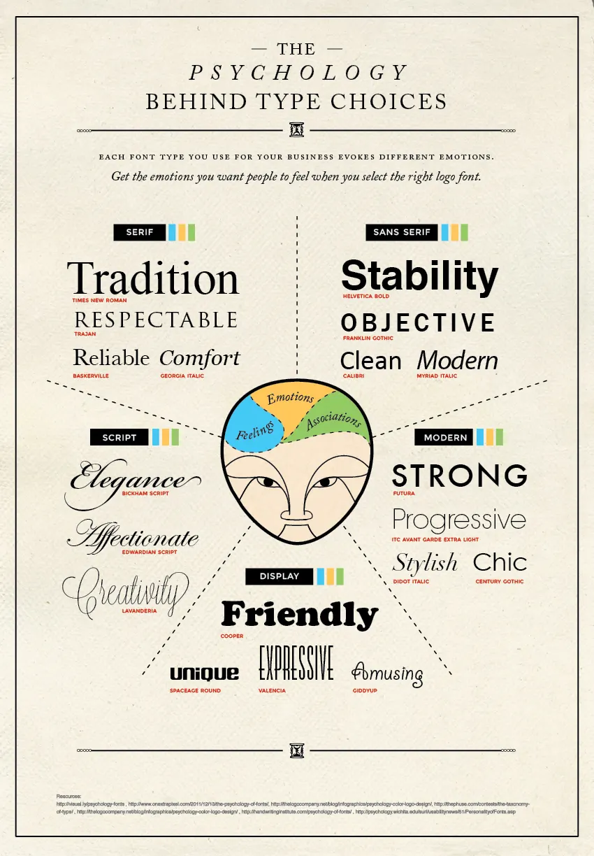 Source: https://www.crazyegg.com/blog/psychology-of-fonts-infographic/
The more cursive fonts may go well with your website if it fits in with your niche and what your brand is all about. For instance, note how Baking Mad uses a variety of fonts to make their content easy to read as well as showcase creativity—an element expected from a baking website!
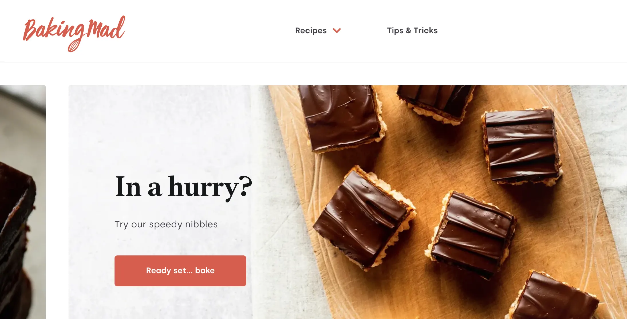 Source: https://www.bakingmad.com/
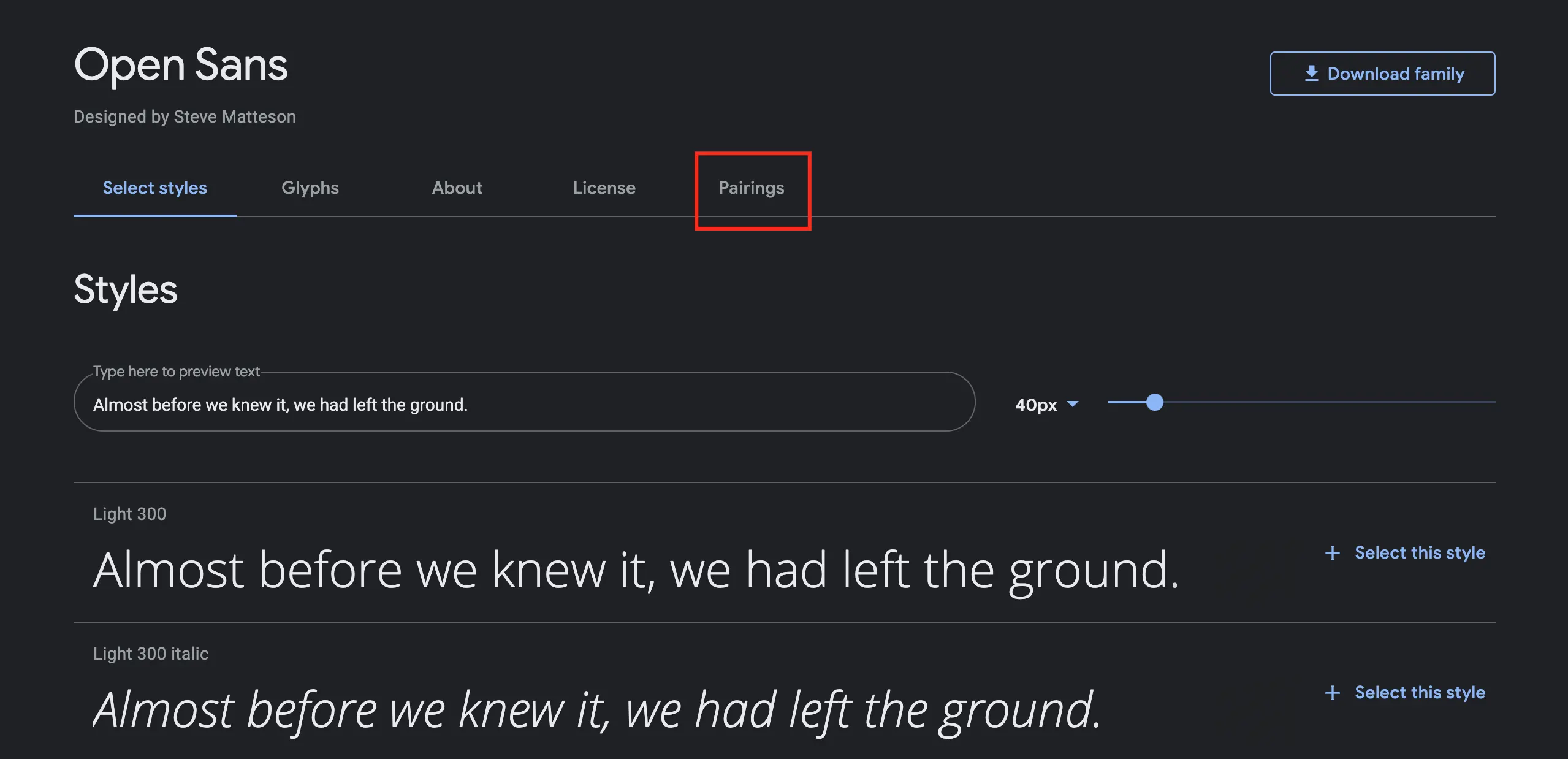
For the majority of your site’s content, you want to be playing around with 2-3 fonts. And there’s a really easy way of getting started with this: Google Fonts.
Simply head off to Google Fonts and you’ll see a page full of Serif, San Serif, Display, Handwriting, and Monospace fonts. Let’s say you like the look of Open Sans. What you then need to do is click on it and then go to the tab called ‘Pairings’
With just a few clicks you get useful pairings with Open Sans that you could directly consider for your website. You even have a toggle option that switches the fonts used for the subheadings and the content underneath.
Here’s a preview of Open Sans with Poppins.
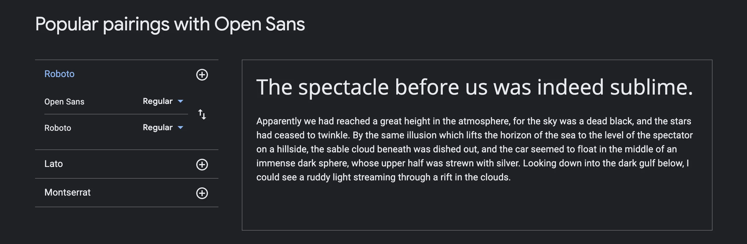
Using Google Font’s suggestions is a super useful way of giving yourself options that are sure to work.
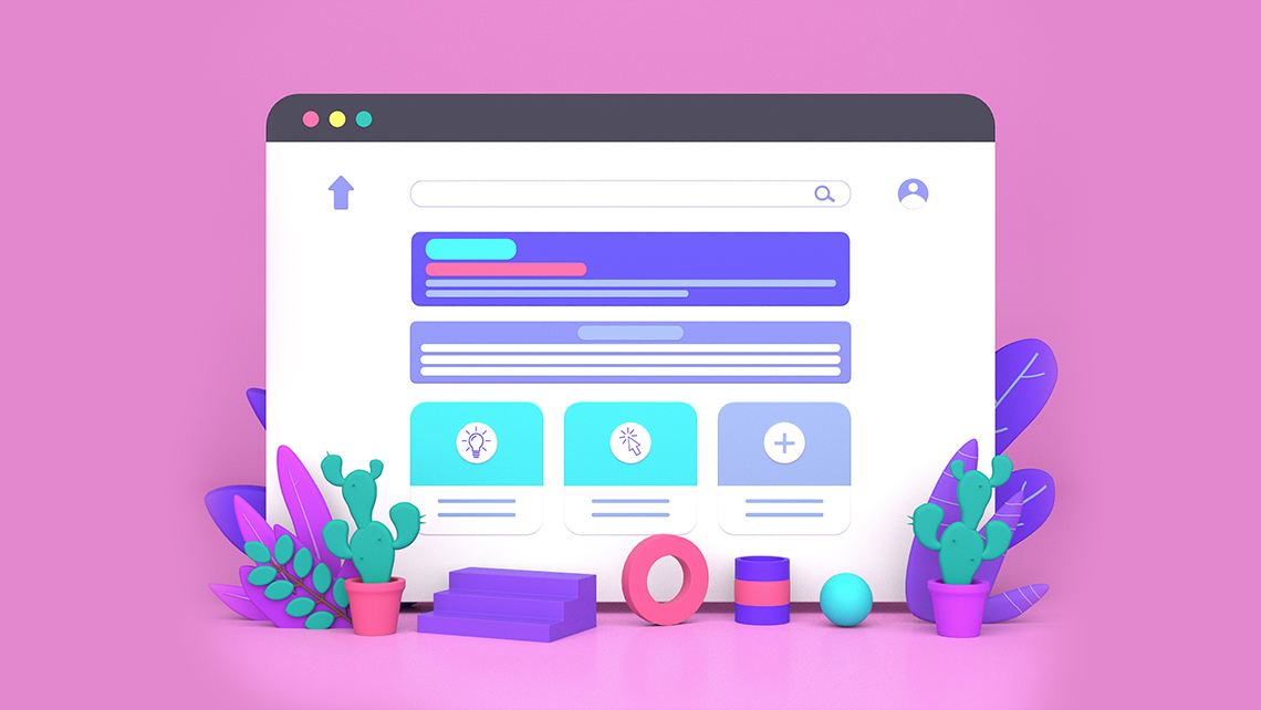
Use professional-looking visual elements
The quality of the visuals you use online speaks volumes for the credibility you gain from potential customers. Think about it: Would you trust a site with a sloppy design and incoherent images, or a site that has a contemporary, professional look to it? That’s why many choose to avail professional visual marketing services.
Since visuals speak louder than words, here’s an example: OLA Cabs.
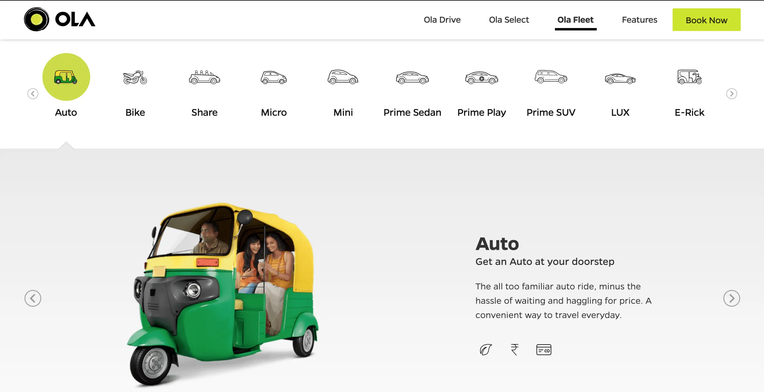 SOURCE: https://www.olacabs.com/
Notice how everything from the logo and icons to the neatly-edited rickshaw speaks of a degree of professionalism.
Another example: Fresh Menu
New to you? Well, it's new to a whole demographic, but enter their website and it leaves you with no second thoughts with respect to quality.
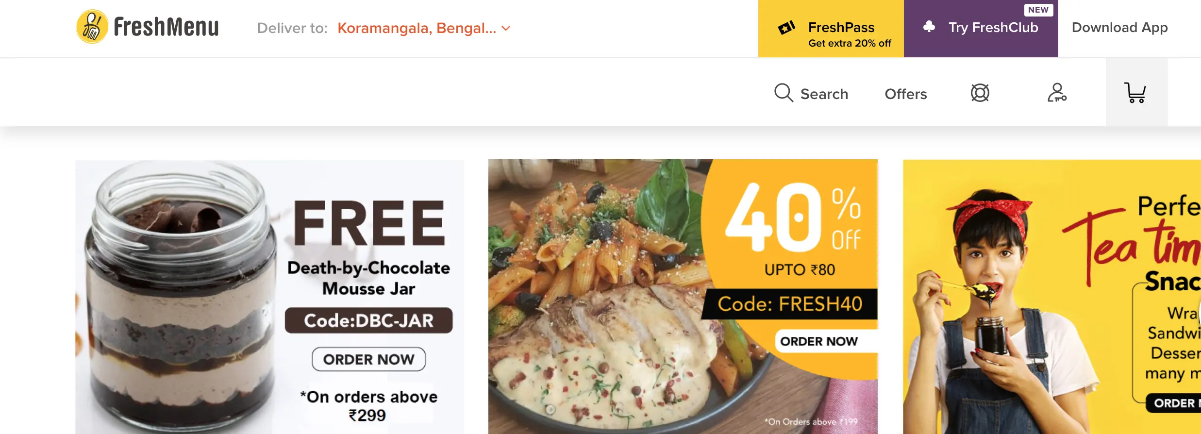 SOURCE: https://www.freshmenu.com/
With a magnificent contemporary logo, awesome fonts, and professional photography, you know that what you’re ordering is going to be a treat.
These two examples have a lot to say in terms of website basics for small business, and best of all, you can make lots of progress by just emulating the quality of the visual content they publish.
Declutter your homepage
Minimalism is an overlooked element of design and something you consider employing as it improves the overall aesthetic of your homepage. Top-tier brands such as Apple or Lamborghini have minimalistic homepages and therefore, are a lot more appealing to audiences.
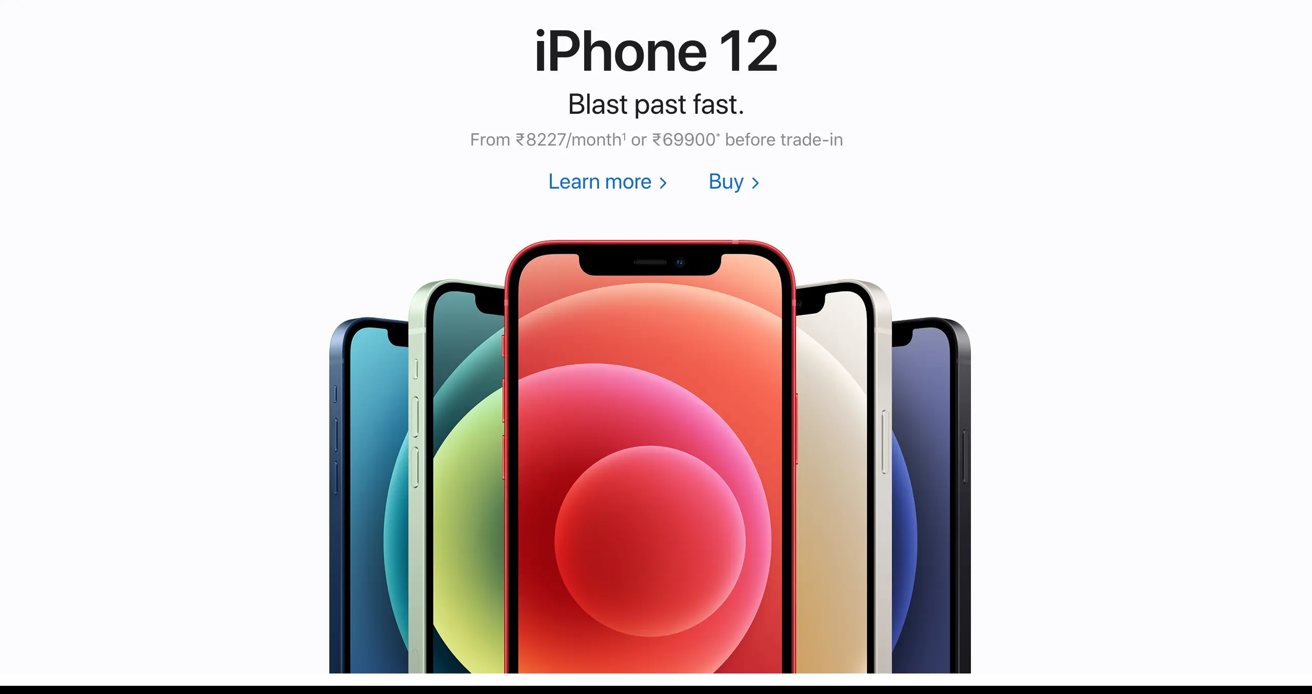 SOURCE: https://www.apple.com/in/
A cluttered homepage is also overwhelming for first-time visitors. The abundance of choice and mixture of colours can easily confuse the TG and distract them from your main message. Intelligent use of negative space (more on this later) can streamline the flow of information and virtually control the user’s navigation.
Make your website easily navigable
A crucial element of webpage design is navigation. There are at least 3 elements you can finetune here, and all these will work towards keeping your website’s bounce rate low.
- Have a clear navigation bar at the top
Most websites have their navigation menu at the top and segregating your content into 6-7 buckets is way better than having it crowded. If you need to include many elements simply use drop-down menus.
Consider PayU’s crisp and clear menu:
 SOURCE: https://payu.in/
- Create a narrative to your homepage
Accessible sites have a clear flow to their content and your goal should be to tell your story to a first-time visitor before they tune off. Readers adopt a left-right, top-down approach when scanning data and your website design must accommodate this.
PayU makes understanding their product as simple as scrolling through their homepage. Whether you’re a developer or a small business owner, the site walks you through the USPs of the offering while using colour and design to delineate sections.

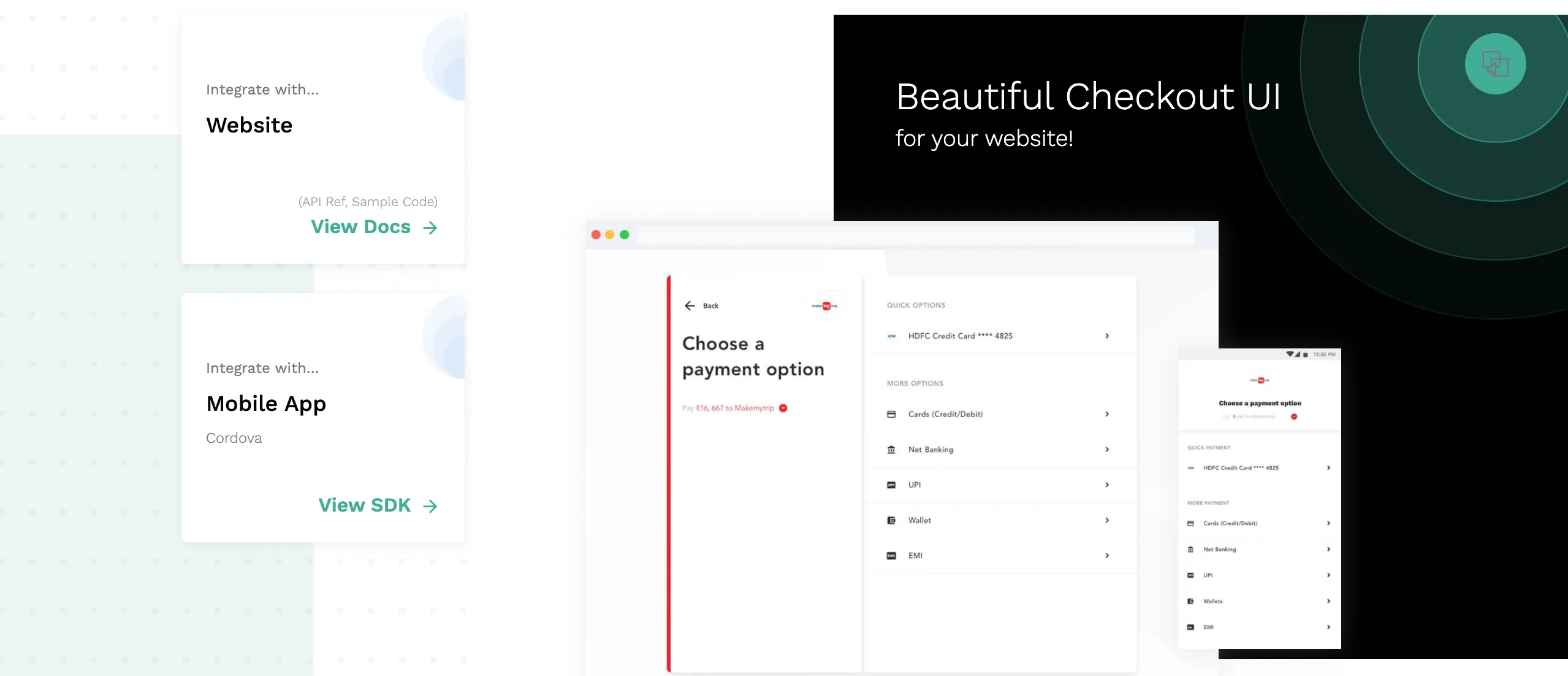
- Link your pages to one another
Links help you establish connections between your content and are a good way of decluttering your home page or landing pages. So, for instance you can have a high-level overview of your services on your homepage, but link to standalone pages that contain in-depth information. This way readers aren’t overwhelmed by data, and neither do you compromise on explaining your product/ service in full.
See, once again, how PayU has separate links for website and mobile integration.
Include a compelling CTA above the fold
What to put on a website for business? If there’s one element that enjoys any sort of universality, it’s the CTA button! CTA stands for Call to Action and the ‘fold’ refers to the section that the user sees when s/he first loads the page. In other words, whatever you need to scroll to be able to see, lies under the fold.
Sevell + Sevell, Inc. indicates that 45 seconds of a person’s time is all you’ve got, and Crazy Egg is less optimistic, positing that users stay on a website for a mere 15 seconds. In any case, just remember that your first impression counts and if you want to incite a positive user response, you’ve got to provoke it with a CTA.
Consider the Indian start-up, Haptik, that provides virtual AI assistants for companies. As you’d expect, their goal would be to get customers to try their product and hence their CTA is simple: “Get a demo”
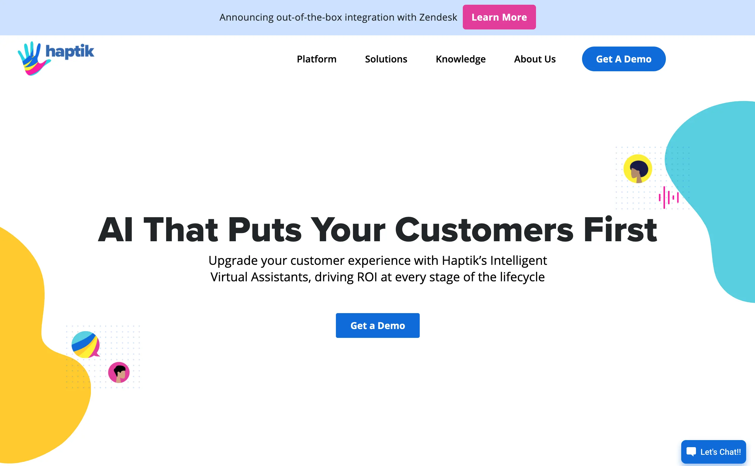 Source: https://www.haptik.ai/
The CTA is bang in the centre, and even if the user skips reading all the other content, Haptik has achieved its goal if a user clicks the button before leaving.
How to write a good CTA? Follow these website tips for writing great copy.
- Start with a verb
- Keep it short
- Advertise discounts
- Play around with FOMO
- Know what you want from your user
Carve out plenty of negative space
If you watched carefully, Haptik’s design was a prime example of using negative space well, but to make it clearer, here’s another example. Note how Zomato and Uber Eats have different goals for their website, even though both are similar companies.
Zomato’s layout focuses on their search bar, but also gives the customer the option to directly jump to a section such as ‘Go out for a meal’ or ‘Zomato Pro’.
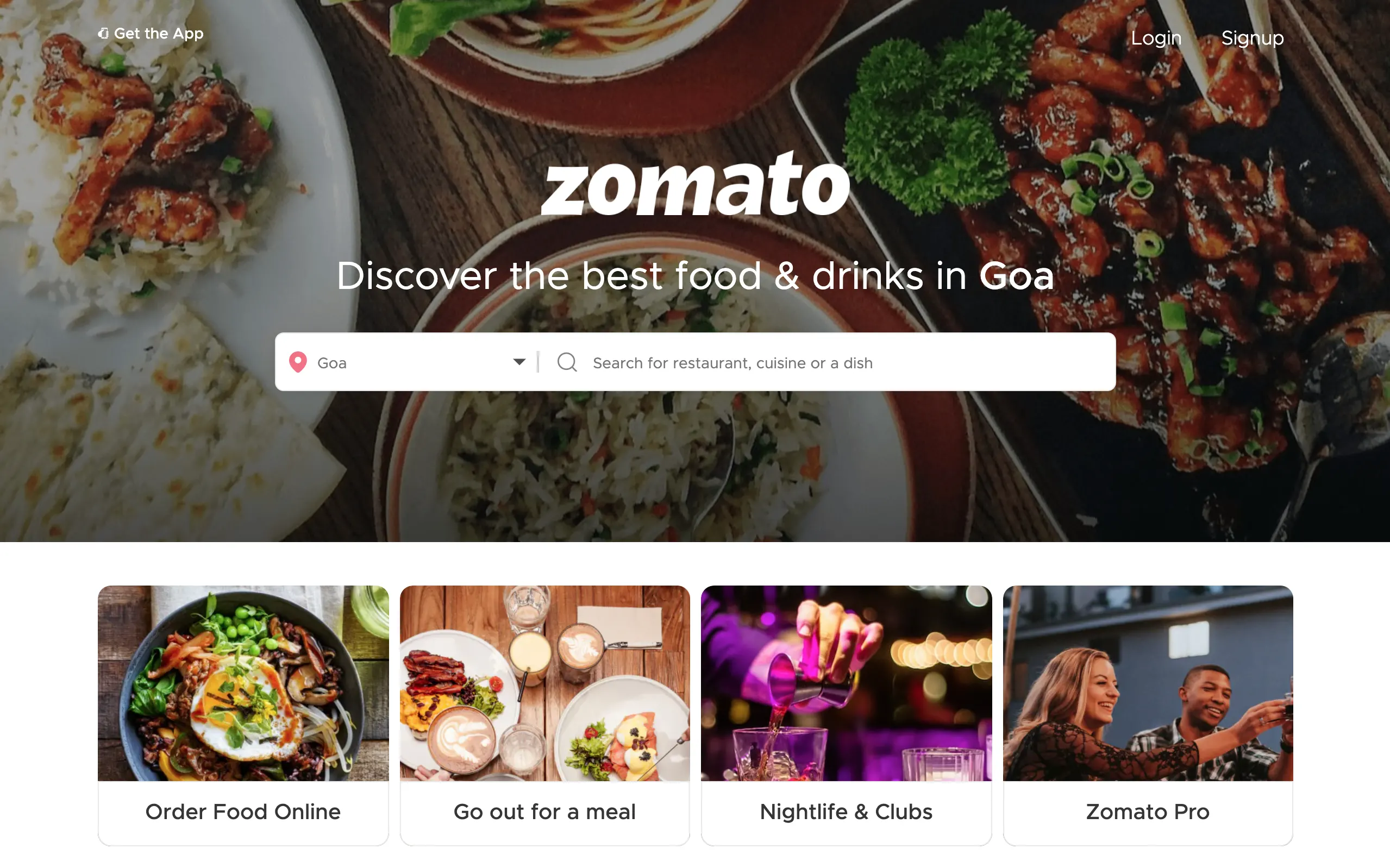 SOURCE: https://www.zomato.com/goa
Uber Eats, on the other hand, has one simple focus point – their search bar. And to shine the spotlight on it, they make use of negative space.
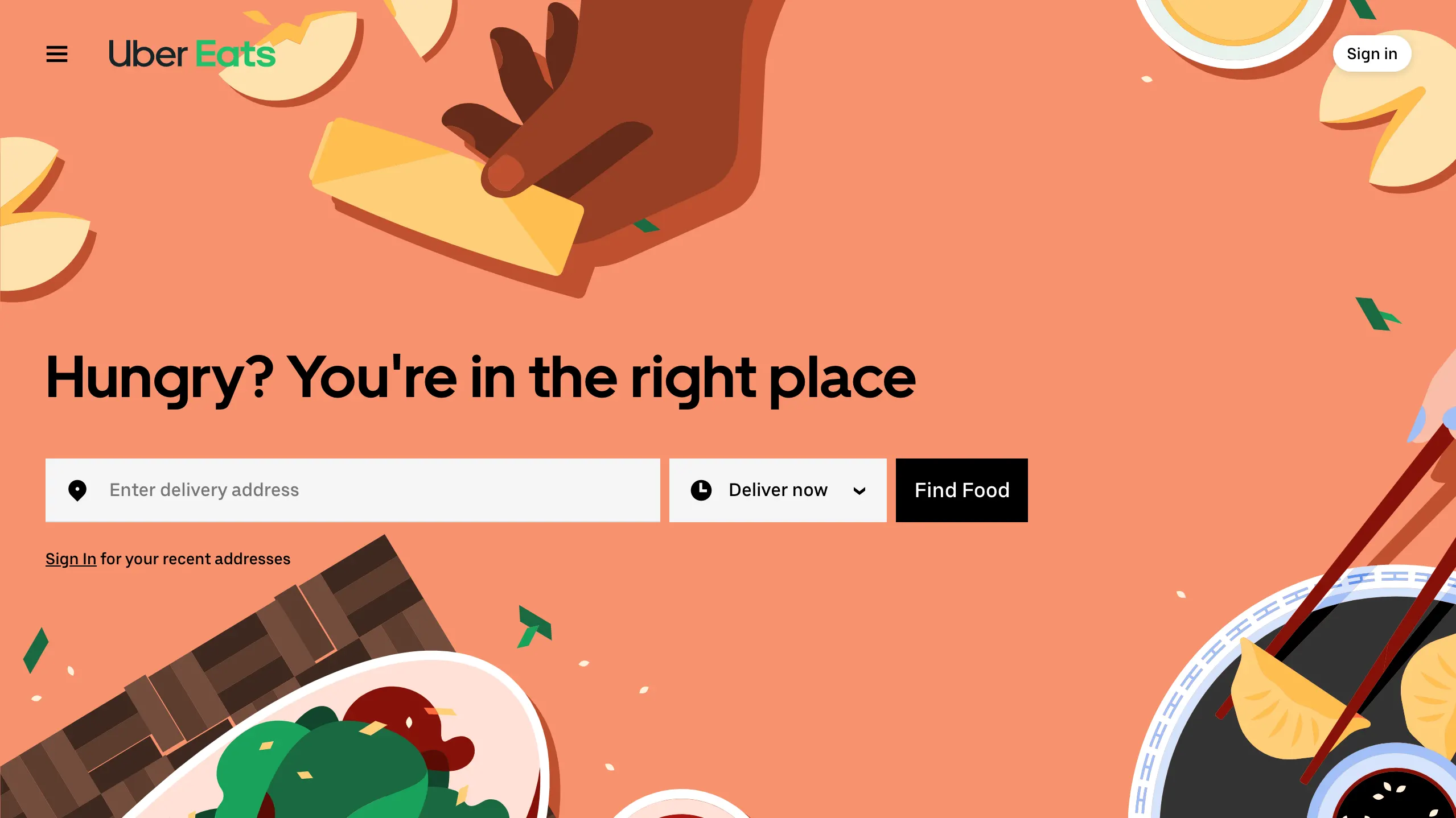 SOURCE: https://www.ubereats.com/
If you haven’t figured till now, negative space indicates the space between and around elements. It is sometimes called whitespace, but as you can see from the examples, it needn’t be white at all. The concept is well known in art, architecture, and even interior design. Negative space is where less is more, and you can use it to highlight elements on your webpage.
Add social proof to gain customer trust
Nowadays, it's common practice to have a section on the homepage dedicated towards testimonials. This is a great way of obtaining the confidence of a potential client. Nothing works as well for a brand as word-of-mouth testimony and hence, this one has to be among the top website tips in 2020. For a small business, it is imperative to showcase the goodwill of the big guns, or other customers in general.
Check out Quire’s website.
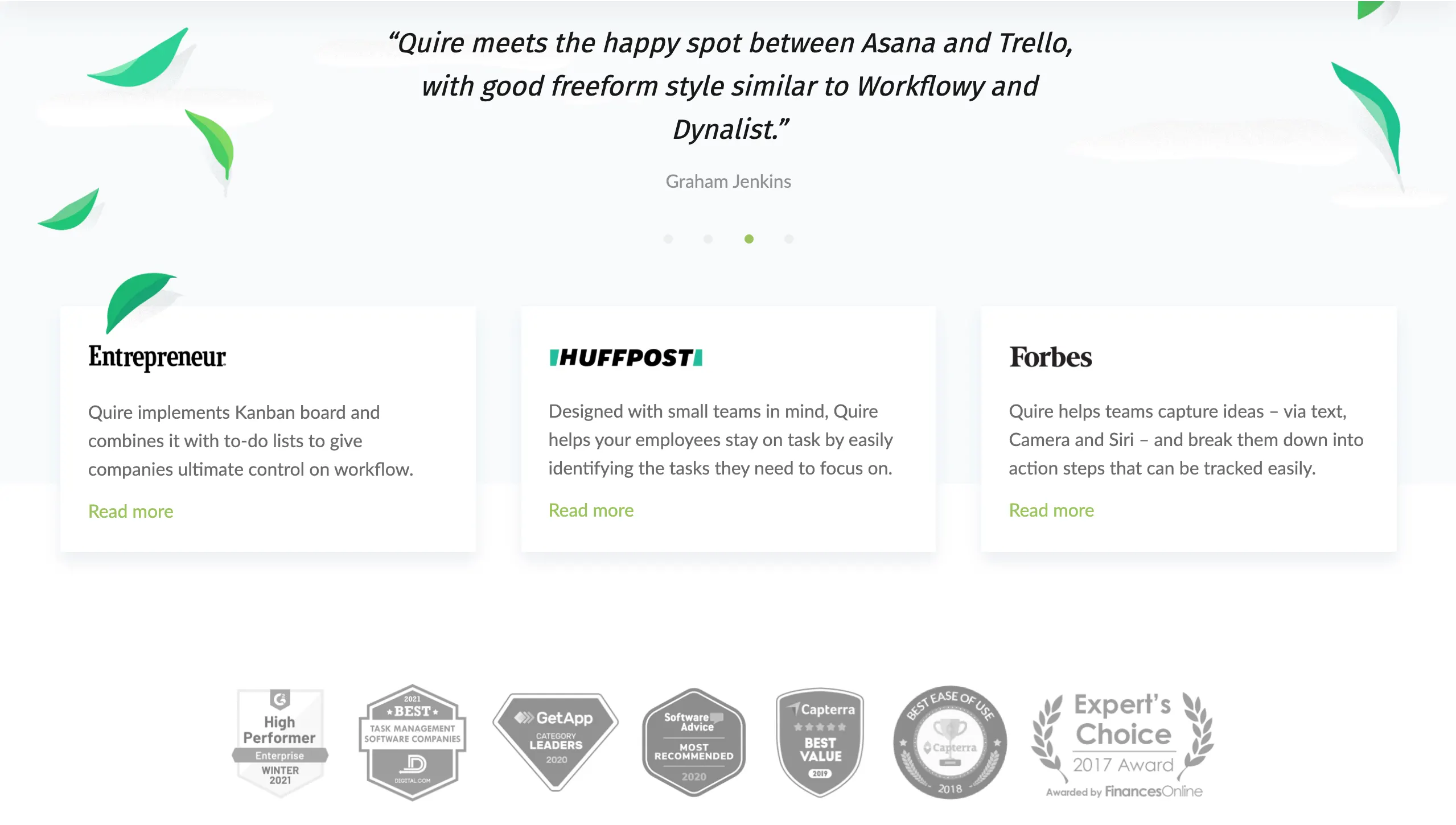 SOURCE: https://quire.io/
It has running quotes, a few static ones, and a list of awards. Quire provides productivity software and based only on this small section of their website, you know that what they offer is quality. In fact, their website design is chock full of social proof. There are plenty of ways in which you can show consumer trust and satisfaction. For instance, if you sell a product, you could include its ratings and reviews.
Showcase your products and services well
Most business websites are a gateway to products or services, and it’s up to you to make your site a gateway and not a maze. You can look up other small business websites for ideas and then tweak it to your USPs. However, in some cases, highlighting what you offer is not very easy.
Locus, a logistics start-up, for instance, needed to find a creative way to showcase their services.
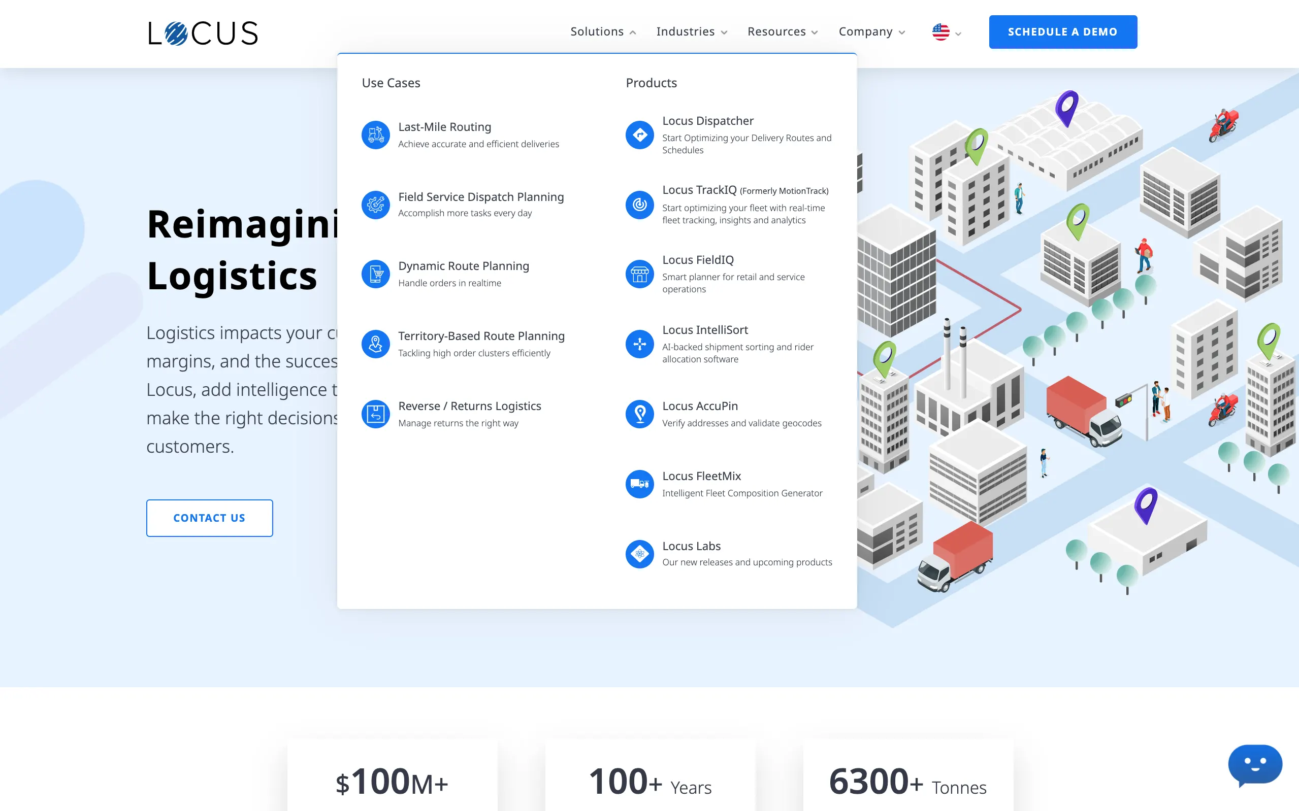
Locus’ answer to the problem is to categorise their solutions as per name and as per use case. This makes it extremely simple for end-users with a particular ‘key word’ in their mind to find what they are looking for. Your goal should always be to provide the shortest possible route to checkout.
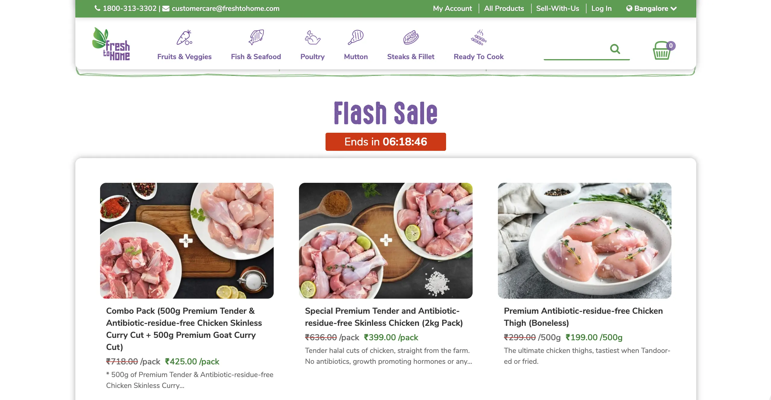
FreshToHome has an extremely attractive layout, which gives users a clear way to navigate to the type of food they want, via the menu bar, while also providing quick access to products on a discount.
 SOURCE: https://www.freshtohome.com/
And if you spotted it, the countdown timer is a great tool to making checkout even faster!
Optimise your webpage for mobile compatibility
To truly improve your traffic numbers, you must optimise your website for mobiles. Even as early as 2012, Google has been making this point extremely clear: your business needs to have a mobile-friendly website.
Today, about 50-60% of web traffic comes from mobile and with smartphones being cheaper to access than laptops, you can expect this trend to stay put. In terms of mobile-friendliness, there are several tips on creating a website for a business that works across devices. But, at the very least, to optimise your business website for mobile you need to consider two things: responsive web design and speed.
- Responsive web design (RWD)
A responsive web page is one that adapts to the screen size and orientation of the device. So, it doesn’t matter whether your user is sitting behind a PC in a cybercafé or thumbing through content on a busy train, your website will always be optimised for the best user experience.
If you want to check if your website is mobile friendly, simply use Google’s Mobile-Friendly Test tool.
As an example, consider Shuttl’s website: https://ride.shuttl.com/
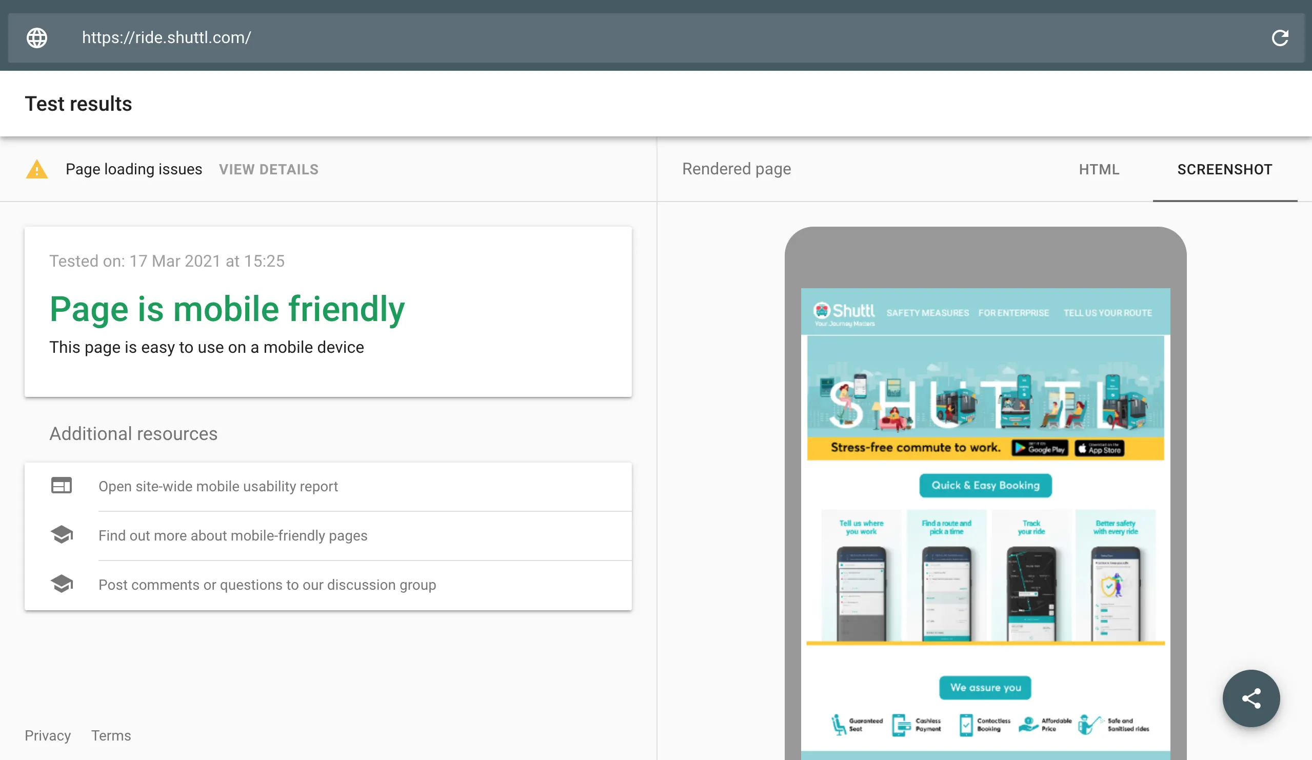
Google gives it a thumbs up and you can even see a preview of how the site looks on mobile. It sure looks good for Shuttl, but wait, there’s another factor to assess too – speed!
- Mobile speed
Off late Google has been taking pains to educate businesses about the necessity of having a fast website. Even in 2019, on the Think with Google blog, Google noted that a 1-second delay in mobile load time can impact conversion rates by up to 20%.
Now, in a 2020 blog, Google notes 3 opportunities for business websites, in terms of mobile page speed. a. faster site means more probability of user reaching checkout b. faster site means people stay longer and buy more c. faster site means a lower bounce rate
If you think that all of this is superfluous, consider Google’s findings: a 0.1-second improvement in mobile site speed translated to an 8.4% better conversion rate for retail sites and a 10.1% better conversion rate for travel sites. Sounds amazing, right? Go get your business website tested!
Here are 2 free tools from Google you can use:
Test My Site is very useful as it gives data for 3G and 4G connections, something that’s of great importance if you own a small business in India. Its results are based on ‘real world data collected via the Chrome User Experience Report (CrUX)’.
Page Speed Insights also offers a list of helpful solutions to increasing your sites’ speed. In this case, you can review the performance of your mobile site and desktop website. Its suggestions are really actionable, so don’t miss out on them.
Compliment web design with great content
The 10 tips for starting a website listed above are sure to get you on the right track to enjoying high traffic and sales. But this guide would be misleading if it didn’t account for the role of good content.
In simple terms, key to running a successful website is partnering great website design with compelling content. And it’s one thing to write grammatically-consistent content. It’s quite another to write an SEO-friendly copy that’s grammatically correct. The best websites have top-notch content on their home pages and landing pages and every small business should leverage the power of content to grow bigger.
Here is a prime example of effective web design (colours, visuals, negative space, etc.), accompanied by superlative content (CTAs, content).
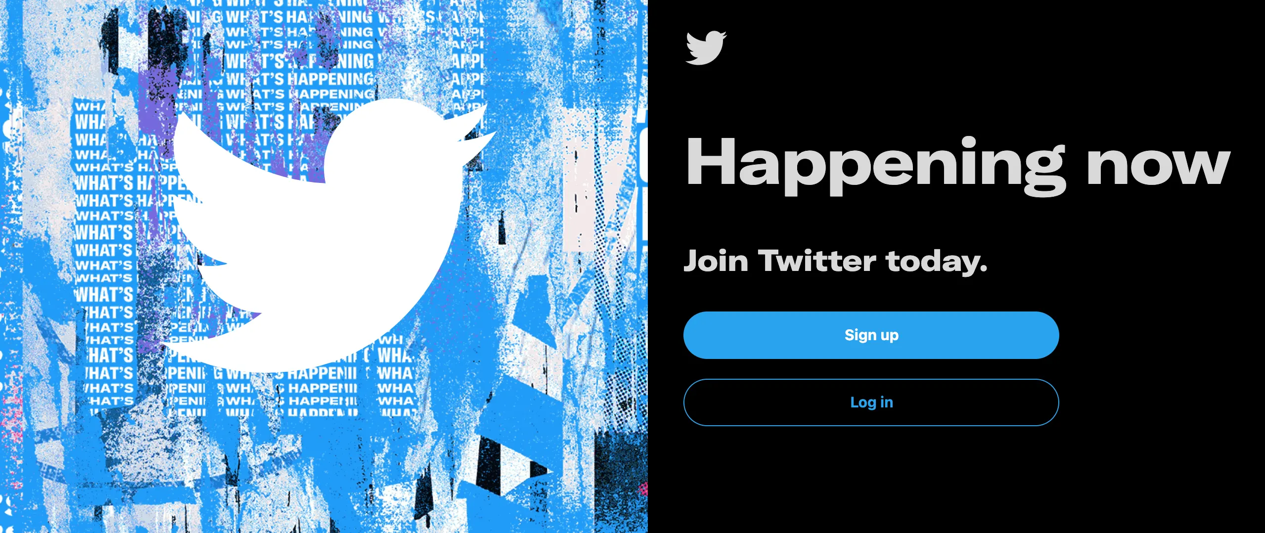 SOURCE: https://twitter.com/?lang=en
To better your website’s content, grow your brand with Edisol. Our content-first approach to digital marketing will ensure your website is not just discoverable, but also relatable, proactively engaging and playing a key role in your target audience’s user journey.


